Terrorist Attack World Map From 1970 to 2012

Terrorist Attack World Map! OMG! We can paint the map of the world by plotting out each terrorist attack since 1970. Terribly sad!

0

OMG! We can paint the map of the world by plotting out each terrorist attack since 1970.

The brighter spots on the terrorist attack wold map show the areas with most tragedies. They are mostly concentrated in conflict regions across the world.

This terrifying map is so simple, but says so much about the world. I am completely baffled by the number of terrorism acts since 1970. Especially in Europe (i.e., Spanish and Portuguese dictatures, IRA in the UK), Central America and North west of South Amarica (dictatures, drug delicts?). The darkest parts are ‘safe’ because so few people live there.

This world map by Datatracker was created by plotting out each terrorist attack since 1970. Terrfying!, terrorist attack world map, Terrorist Attack World Map, world map terrorist attack, terrorism act world map, World map created by plotting out each terrorist attack since 1970, terrorist attack world, terrorist attack map, map of terrorist attack, Terrorist Attack World Map! OMG! We can paint the map of the world by plotting out each terrorist attack since 1970. Terribly sad!, map of terrorist acts around the world, terrorism on world map, terrorism, terrorist attack, terrorism map, terrorist attack map
This world map by Datatracker was created by plotting out each terrorist attack since 1970. Terrfying!

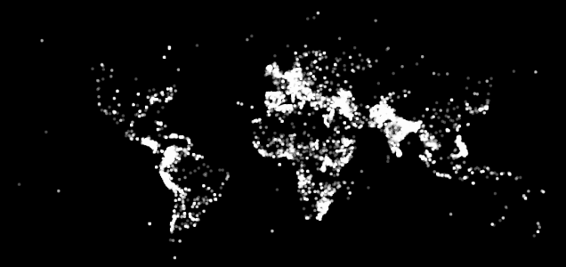
The terrorist attack world map was created by Data Hacker. Reports come from the Global Terrorism Database which records information on terrorist events around the world from 1970 through 2012.

This terrorist attack world map is currently becoming very popular. This may be linked to the tolerated Russian and Israel attacks on Ukraine and Palestina.

Follow us on Facebook and Twitter

Leave a reply

Please enter your comment!
Please enter your name here

This site uses Akismet to reduce spam. Learn how your comment data is processed.