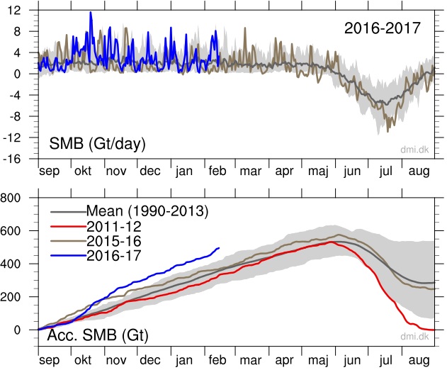
Look at this graph from the Danish Meteorological Institute!
The dark gray line shows the mean from 1990 to 2013. The blue line shows the massive growth this season.

As described officially by DMI.DK: “The figure below shows the total daily contribution from all points on the ice sheet (top) and the same accumulated from September 1st to now (bottom). The blue curves show this season’s surface mass balance in gigatons (Gt; 1 Gt is one billion tons and corresponds to 1 cubic kilometer of water), and for comparison the mean curves from the historical model run are shown with two standard deviations on either side. Note that the accumulated curve does not end at 0 at the end of the year. Over the year, it snows more than it melts, but calving of icebergs also adds to the total mass budget of the ice sheet. Satellite observations over the last decade show that the ice sheet is not in balance. The calving loss is greater than the gain from surface mass balance, and Greenland is losing mass at about 200 Gt/yr.”
Is this an all-time record? I don’t know… But it sure far surpasses any growth in the past 27 years.


