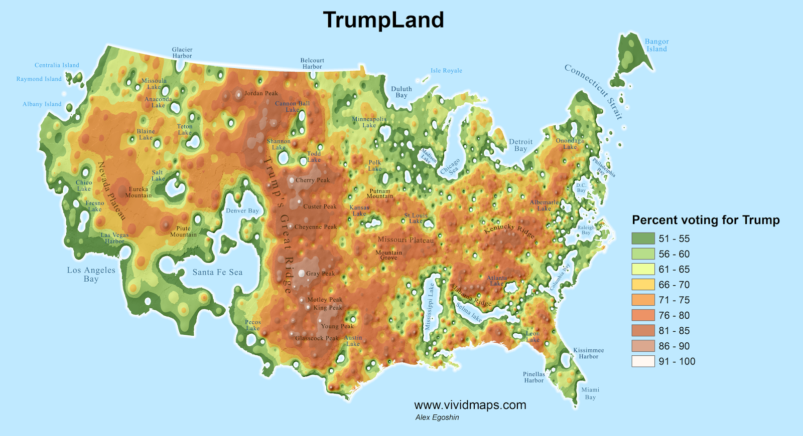
In the aftermath of Donald Trump’s election, you might have seen maps showing “TrumpLand” and the “Clinton Archipelago”, essentially, creating two new geographic bodies out of the areas that voted for Trump or Clinton. Well, Alex Egoshin of Vivid Maps has now applied a similar dynamic to religious faith, creating a new map based on the percentage of people in a given area that believe in a higher power. Redder areas are more religious, while bluer areas are less so.
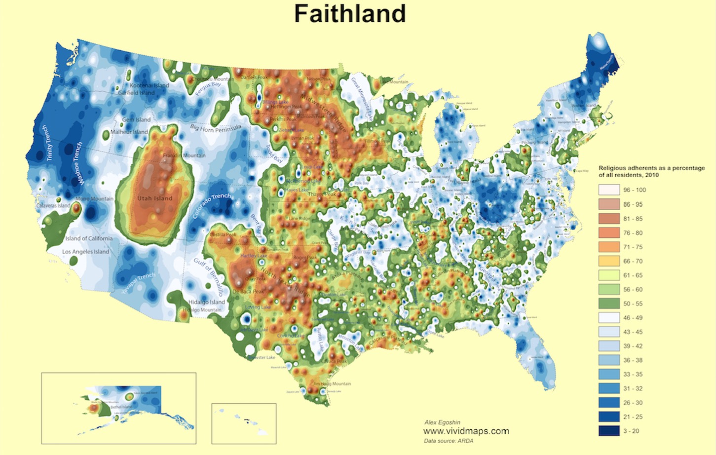
Take, for instance, the “Utah Island”, where more than 60% of Utah residents are Mormon, so it’s unsurprising that the state makes up such a large contiguous area of red.
By the way, here are the Trump and Clinton maps. Pretty interesting to look at too:

Maps are always pretty to the point!
Follow us: Facebook and Twitter
via Vivid Maps


As feckless as the GOP establishment is, after this week, anyone still a Democrat is an enemy of the people or pig ignorant to the level of mental illness.