The effect of this amazing map is not only beautiful and mind-blowing but also informative — more than 150 years of hurricane data.
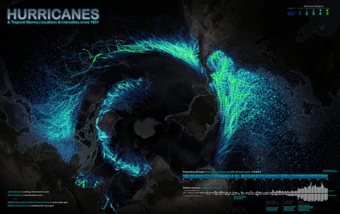
- This hurricane map offers a unique perspective of the Earth with Antarctica in the middle, and the other continents around: The Americas are on the right, Asia is on the left.
- The storms plotted on the map grow brighter with increasing intensity.
- This map compiles U.S. government data on tropical storms and hurricanes from 1851 through 2010.
- The number of storms leaps up in the latter half of the 20th century due to technological advances (satellites and hurricane-hunting aircraft).
- The dearth of storms in the Eastern and Southern Hemispheres is a product of a lack of data since the USA began to add storms from these regions to the database only in 1978.
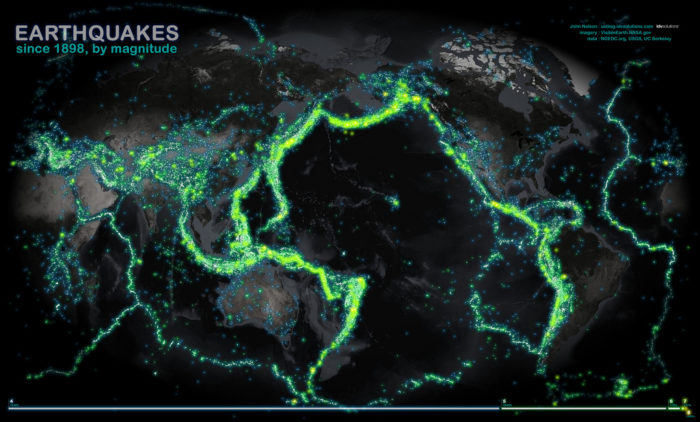
The same scientist (John Nelson) has also created a map on earthquakes:
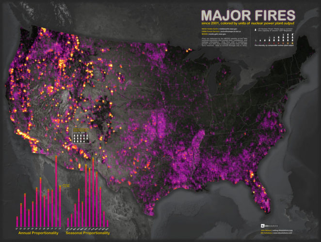
And Wildfires: